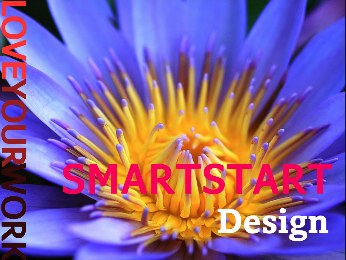
Be a pop of colour in a black-and-white world!
With so much focus on e-learning and the promotion of training programs encouraging you to start creating and offering online courses, it seems timely to share this article discussing 6 Ways Colour Psychology Can Be Used to Design Effective eLearning published on Shift’s eLearning Blog.
Putting Colour Psychology To Work
In reading the recommended article you’ll learn how to:
- use colour to direct attention
- use strong colours strategically
- improve readability with colour
- enhance learning and improve comprehension
- use colours based on their meanings
- choose the right colour combinations
There’s no question that the judicious use of colour can make many things more attractive but using colour psychology effectively does require some skill. I know your intentions are to create the best products and services possible to sell to your target markets. And I recommend you explore and leverage colour psychology in all your design choices.
If you’re really keen to explore this subject further, try the Colour Theory for Non-Designers assessment and see how much you instinctively know but might not yet be taking advantage of in your own work.
Colour psychology is a fascinating science. Start putting it to work for you!
More next time. Until then, remember to LOVE YOUR WORK, whatever it may be.
PS Did this post speak to you? If so, please feel free to share it with your own communities, friends and followers. Thanks for sharing the love! ♥♥♥


